Hva er Pantone®-fargematching og hvordan kan det styrke merkevarebyggingen din?
Forfatter: Sarah Roberts
I en verden full av logoer og budskap er det viktig å opprettholde fargekonsistens for å skape en minneverdig og profesjonell merkevarebygging. Men det kan være vanskelig å oppnå dette, ettersom farger kan se helt forskjellige ut når de trykkes på plast, bomull eller papir. Det er her Pantone® Colour Matching kommer inn i bildet.
Pantone® Colour Matching, også kjent som Pantone® Matching System (PMS), er et standardisert fargesystem som brukes i ulike bransjer, for eksempel grafisk design, trykkerier og motebransjen.
Det ble utviklet av Pantone® Inc. i 1963 og har siden blitt den foretrukne metoden for å sikre konsistente farger i varehandelen. Så hvordan fungerer det egentlig? Og hvordan kan dette overføres til merkevarebyggingen din?
Et raskt overblikk
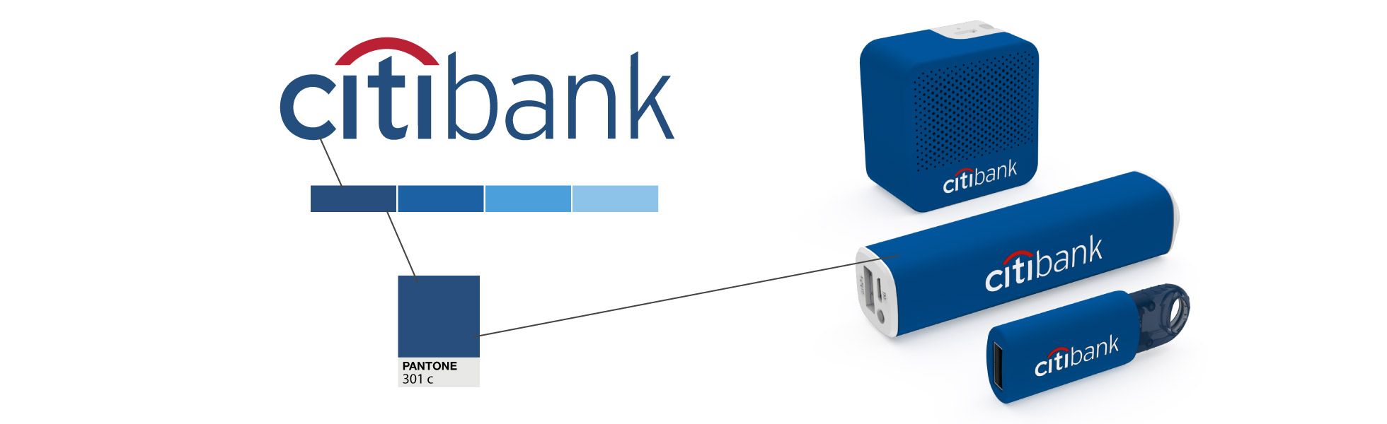
Pantone® Colour Matching sikrer at merkevarene dine samsvarer nøyaktig med bedriftens offisielle farger, noe som skaper et konsekvent, profesjonelt utseende på tvers av alle produkter.
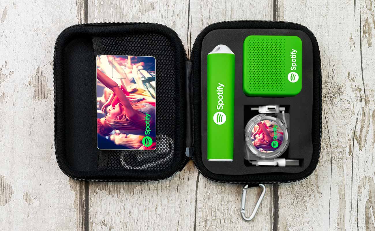
Hos Flashbay kan vi bruke Pantone®-fargematching på produkter som powerbanks, drikkevarer og tilbehør, slik at logoen og merkevarens farger stemmer perfekt overens.
Denne prosessen bidrar til at varene dine skiller seg ut, styrker merkevaregjenkjennelsen og opprettholder visuell konsistens på arrangementer, i markedsføringsmateriell og med teamet ditt.
Grunnleggende om Pantone®-fargematching
Pantone® Colour Matching er i bunn og grunn et system som tildeler koder til spesifikke farger for å sikre konsistens på tvers av ulike medier. Disse Pantone®-fargekodene består av et tall eller en bokstav etterfulgt av tre eller fire sifre.
1)Den første delen av koden representerer typen materiale fargen skal brukes på, for eksempel papir eller stoff.
2)Den andre delen angir fargenyansen, og de to siste sifrene angir fargens intensitet eller lysstyrke.
Dette systemet gjør det mulig å kommunisere og gjengi farger nøyaktig, og eliminerer eventuelle avvik som kan oppstå på grunn av variasjoner i trykkmetoder eller materialer.
Det gir også designere, trykkerier og produsenter et felles språk som de kan bruke når de diskuterer spesifikke farger.
Slik fungerer Pantone® Colour Matching System
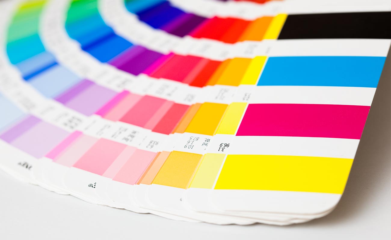
Pantone® Colour Matching starter med en fysisk Pantone®-fargeprøvebok, kjent som Pantone® Formula Guide. Denne omfattende fargeguiden inneholder over 1800 standardiserte farger og fargeprøver som er trykt på ulike typer papir for nøyaktig gjengivelse.
Når en designer velger en spesifikk Pantone®-farge til produktet sitt, kan han eller hun se i denne guiden for å finne ut nøyaktig hvilken blekkformulering som kreves for å oppnå den aktuelle fargen.
Hvis en designer for eksempel velger en bestemt blåfarge fra Pantone®-guiden til logoen sin, kan han eller hun være sikker på at den samme nyansen vil bli trykt på en rekke ulike typer markedsføringsmateriell, inkludert visittkort, emballasje og merchandise, for å øke gjenkjennelsen av merkevaren.
Hvordan Pantone® skiller seg fra CMYK
Pantone® Matching System og CMYK er to svært forskjellige måter å jobbe med farger på.
PMS er gullstandarden for fargekonsistens. Det bruker forhåndsblandet blekk med unike koder for hver farge for å matche den nøyaktige nyansen hver gang, uansett materiale, sted eller skriver. Det er perfekt når presisjon er nøkkelen.
CMYK, derimot, står for Cyan, Magenta, Yellow og Key (Black). Det er standarden for tradisjonell firefargetrykk. Det fungerer ved å legge små prikker av disse blekkene i lag for å skape den fargen du er ute etter.
Selv om CMYK dekker et bredt spekter av farger og fargetoner, kan den ha problemer med å matche livligheten eller nøyaktigheten til enkelte Pantone®-nyanser, spesielt metalliske eller fluorescerende nyanser. I tillegg kan CMYK-utskrifter variere noe avhengig av skriveren eller materialet som brukes.
Merk: CMYK er det systemet vi bruker i silketrykkprosessen vår for å produsere enklere logoer og bilder med opptil fire farger. Resultatet er fortsatt visuelt imponerende, og dette er det alternativet vi anbefaler for design med mindre komplekse farger.
Hvorfor Pantone®-matching er avgjørende for merkevarer
Hvis du kan få like levende farger fra CMYK-systemet til en lavere kostnad, hvorfor skulle du ikke bare holde deg til det?
Vi forstår at mindre selskaper eller nystartede bedrifter ønsker å holde kostnadene på et minimum, men det er mange fordeler med å investere i Pantone®-fargematching fra starten av for å styrke virksomheten på sikt.
Her er de viktigste måtene det er avgjørende for merkevarer, reklame og mer:
Merkevarekonsistens:
Dette er den viktigste fordelen ved å bruke PMS.
Ved å bruke en bestemt Pantone®-farge når du lager logoen eller merkevaredesignet ditt, sikrer du at utseendet ditt er ensartet på tvers av alle merkevarer og materialer, fra reklame til varer og mer.
Dette er spesielt viktig hvis du ønsker å trykke logoen eller merkevaren din på forskjellige materialer, fordi fargene kan variere mye avhengig av hva de trykkes på. Dette kan føre til at produkter, annonser og kampanjer ikke stemmer overens. Når du investerer i Pantone® Colour Matching, blir dette problemet eliminert.
Profesjonalitet og tillit:
Bruk av konsistente og nøyaktige merkevarefarger viser at du er opptatt av detaljer og profesjonalitet, noe som umiddelbart slår an hos kunder og klienter.
Når merkevaren din ser polert og gjennomført ut, viser det at du bryr deg om de små tingene. Denne typen presisjon bygger tillit, og det er mer sannsynlig at kundene oppfatter bedriften din som pålitelig og av høy kvalitet.
Pantone®-matching bidrar til å opprettholde profesjonaliteten på tvers av alle merkevarematerialene dine, noe som styrker det generelle omdømmet ditt.
Gjenkjennelse av merkevaren:
En viktig fordel med Pantone®-fargematching er at det styrker merkevaregjenkjennelsen. Når en signaturfarge brukes konsekvent, blir den et kraftig verktøy som gjør at merkevaren din skiller seg ut og blir umiddelbart identifiserbar.
Ikoniske eksempler er "Tiffany Blue" og "Cadbury Purple" - farger som er så distinkte og konsekvent brukt at de har blitt synonyme med sine respektive varemerker.
Ved å ta i bruk en spesifikk, gjenkjennelig farge og bruke den på tvers av alle medier og produkter, blir merkevarens tilstedeværelse sterkere og mer minneverdig i publikums bevissthet.
Skiller seg ut fra mengden:
I et overfylt marked kan det å velge den perfekte fargen på en reklameartikkel utgjøre hele forskjellen når det gjelder å hjelpe varemerket ditt med å skille seg ut og bli husket.
Det er en game-changer sammenlignet med konkurrenter som nøyer seg med generiske farger eller farger som er "nærme nok", og som ofte ikke etterlater et varig inntrykk.
Ved å finne akkurat den fargenyansen som representerer merkevaren din, kan du sikre at kampanjeproduktene dine gir bedre gjenklang og hjelper deg med å holde deg foran konkurrentene.
Bruksområder for Pantone® Colour Matching System
Pantone® Colour Matching kan brukes på et bredt spekter av produkter og materialer, noe som gjør det til et så allsidig valg for å skape en sammenhengende og profesjonell merkevarebygging. Noen av de mest populære produktene er blant annet
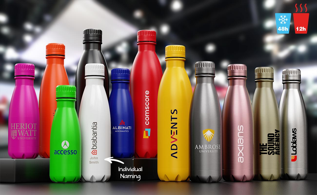
For slitesterke vannflasker i metall, som den klassiske Nova Pure, tilbyr vi full fargematching for å sikre at reklameartiklene dine passer sømløst sammen med merkevareidentiteten din. Disse høykvalitetsproduktene er ikke bare funksjonelle, men fungerer også som et kraftfullt verktøy for å øke synligheten og anerkjennelsen av merkevaren din.
Brevpapir
Du kan lage notatbøker, penner og mapper med merkevare som skiller seg ut på møter eller arrangementer.
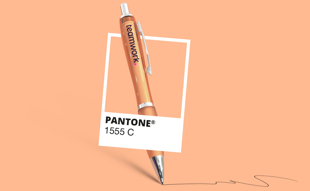
Med Pantone® Colour Matching kan logoen eller merkefargene dine replikeres nøyaktig på alle typer papir eller omslagsmaterialer til notatbøker eller på penner som vår Curve kulepenn, noe som sikrer et profesjonelt og helhetlig utseende.
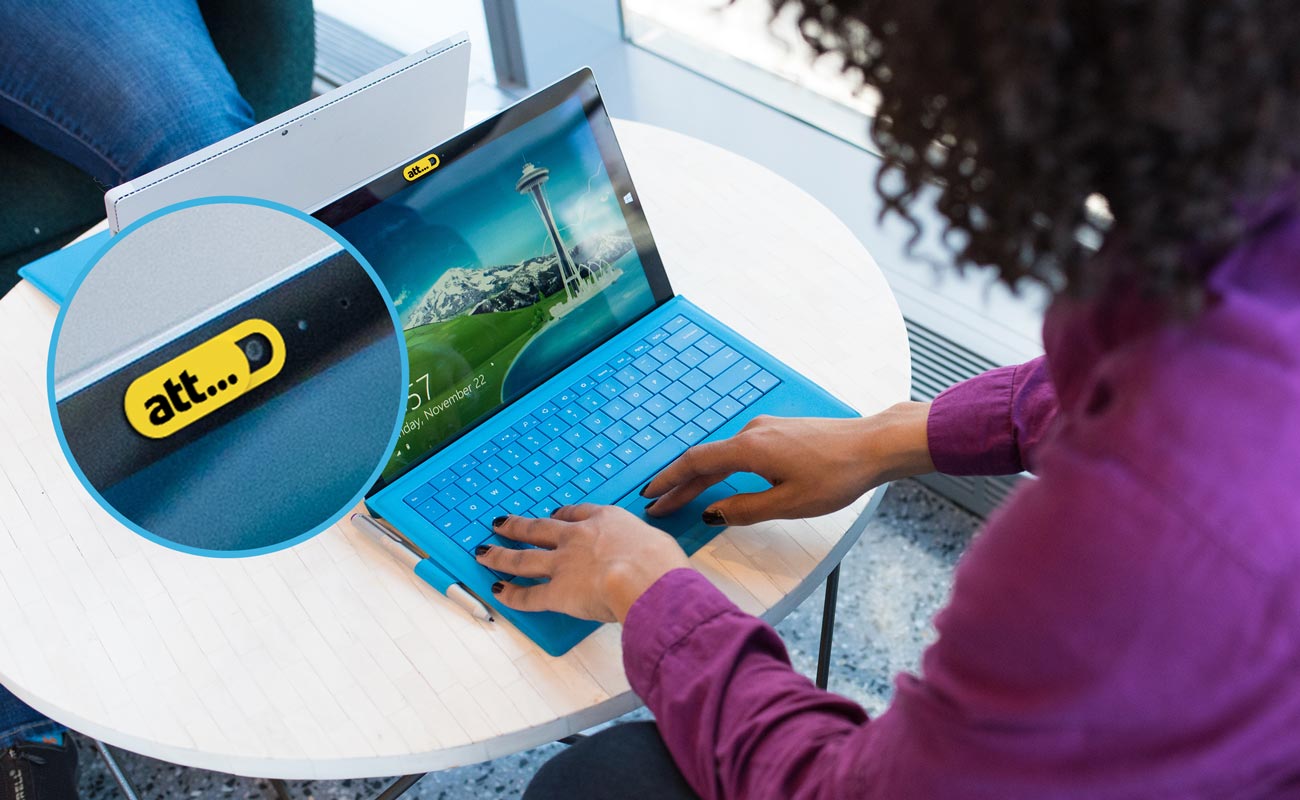
Teknisk tilbehør
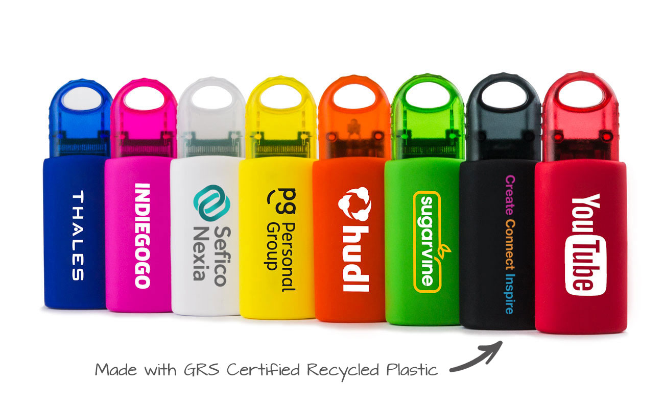
Du kan velge fra et bredt utvalg av teknisk tilbehør som kan fargematches med Pantone®-fargene til dine eksakte merkevarefarger, noe som sikrer et konsekvent og profesjonelt utseende.
Med presis fargematching vil logoen og varemerket ditt skille seg ut på en stilig måte på praktiske produkter av høy kvalitet som kundene eller teamet ditt vil sette pris på.
Fargenes psykologi: Det skjulte språket i merkevaren din
Farger er ikke bare estetiske valg; de fungerer som et skjult språk som kommuniserer følelser og assosiasjoner til målgruppen din. Å velge riktig farge for merkevarebyggingen din kan påvirke hvordan folk oppfatter og knytter seg til merkevaren din på et dypere nivå.
Blå: Blå assosieres ofte med tillit, trygghet og ro, og er et populært valg for banker, teknologiselskaper og bransjer der pålitelighet er viktig.
Rød: Rød er en kraftfull og oppsiktsvekkende farge som symboliserer lidenskap, energi og haster, og brukes ofte i salg, matvaremerker og reklamekampanjer.
Grønn: Grønn representerer natur, vekst og ro, og passer godt sammen med helsebevisste eller miljøvennlige merkevarer.
Gul: Gult er lyst og oppløftende, og formidler optimisme, lykke og kreativitet, noe som gjør det til et perfekt valg for morsomme, energiske merkevarer som ønsker å inspirere til glede.
For å få fargene dine til å fungere, er det viktig med konsistens. Enten det gjelder visittkort, nettside eller swag, er det viktig å bruke de samme fargene overalt, slik at folk kjenner igjen og husker merkevaren din.
Hvis du derimot bruker feil farger eller er inkonsekvent, kan det forvirre publikum og svekke budskapet ditt. Hold det sammenhengende, så vil merkevaren din skille seg ut!
Slik hjelper vi deg: Din partner i perfekte farger
Hos Flashbay er vi stolte av å jobbe tett sammen med deg for å oppnå den perfekte fargematchen for dine reklameprodukter.
Helt fra begynnelsen av prosessen får du tildelt en dedikert kundeansvarlig som veileder deg gjennom design og bestilling av produktene dine.
Vi tilbyr også vareprøver og digitale prøvetrykk, slik at du kan se og godkjenne produktene dine før produksjon for å sikre at reklameartiklene dine passer perfekt til merkevaren din og oppfyller forventningene dine før vi trykker og sender dem i store opplag.
Få et gratis hurtigtilbud på Pantone® fargematchede varer
Hos Flashbay har vi et stort utvalg av tilpassbare reklameartikler som kan hjelpe merkevaren din med å skille seg ut! Fra drikkevarer og penner til vesker, klær, notatbøker og teknisk tilbehør - vi kan matche dine eksakte merkevarefarger med Pantone®-fargematching.
Kontakt oss i dag for å diskutere dine kampanjebehov og se hvordan vi kan gi liv til merkevaren din med Pantone®-fargematchede varer.
Vanlige spørsmål
Hvorfor er Pantone® så viktig?
Pantone® sikrer konsekvent og presis fargematching på tvers av alle reklameprodukter, slik at merkevarens visuelle identitet opprettholdes. Det eliminerer fargeavvik, og garanterer at varene dine samsvarer perfekt med dine spesifikke merkevarekrav for et profesjonelt og sammenhengende utseende.
Hvorfor kalles fargene Pantone®?
Pantone®-farger er en del av et standardisert fargematchingssystem som er opprettet for å sikre konsistens på tvers av bransjer. Hver nyanse er tildelt en unik kode, slik at varemerker kan gjengi de ønskede fargene nøyaktig i trykk, design og reklamemateriell.
Er Pantone®-fargematching tilgjengelig på alle Flashbay-produkter?
Selv om Pantone® Colour Matching ikke er tilgjengelig på alle Flashbay-produkter, kan det brukes på mange av våre reklameartikler i en rekke kategorier. Snakk med din kundeansvarlige eller se på nettsiden vår for å finne ut mer.
Koster Pantone®-fargematching ekstra?
Når du benytter deg av vår Pantone®-fargematchingstjeneste, øker minimumsbestillingsantallet, og det påløper en liten ekstra oppsettsavgift. Dette gjør at vi kan sikre at de fargematchede produktene dine holder høyest mulig standard.
Tar det lengre tid å lage Pantone®-fargematchede produkter?
Nei, normalt er det ingen ekstra ledetid for vår Pantone®-fargematchingstjeneste. Produktene dine vil bli produsert innenfor standard tidsrammer. Se de enkelte produktsidene for mer informasjon.